China won the Asian Games no matter how you look at it. But if you're interested in some quant-like discussion of points and demographics then read on. It's time for our riveting analysis of the Asian Games medal distribution and point scoring.
Our analysis of medals and points was hampered by a remarkably useless Games website. The only useful medal table was the one that listed total medals for each country. There was no breakdown of medals by sex and there was no listing of the number of athletes that each country entered. This is important information that needs to be added to event protocols and not simply left up to the data wranglers, most of whom I'm convinced don't know anything about sports.
I discussed the poor presentation of information in an earlier article about the 2017 SEA Games. There's far more to reporting this kind of information than simply designing a nice looking website.
So, we are left with the total point analysis and the points per million population comparison.
Background
We started doing these analyses during the 2017 SEA Games in Kuala Lumpur because the media and almost everyone else was focusing only on the number of gold medals that each country won with an unexplained disregard for silver and bronze medals. Ranking countries based only on gold medals masks strong performance by countries with stellar athletes who simply are not in the top position. It misses a country's overall strength.
We used the brilliantly conceived McClung Point Scale to give actual value to each medal color: Five points for gold, three for silver, and one for bronze. Calculating points in this manner is a better way to measure overall performance depth of participating teams.
Overall points analysis
Table 1 ranks countries by points. Clearly China is the winner overall no matter how you want to score the competition. But notice how the silver and bronze medals reveal the depth of other countries teams.
For example, Taiwan won two more golds than India but scored fewer points overall because of India's strong 'bench' with 24 silvers to Taiwan's 19. Taiwan had a few better athletes but India is clearly the stronger team.
Likewise, Malaysia beat Bahrain in overall points but won five fewer golds. Malaysia's strength, its silver and bronze medal finishes, exactly mirrored Bahrain's weakness. Bahrain has little overall team strength, as shown by their 12-7-7 combination of medals. This is the signature of a country that is relying on a handful of top performers with little left in the depth chart. (Check out Table 2 to see where Bahrain really shines!)
Qatar is in the same situation as Bahrain with a lopsided 6-4-3 medal spread. Its lack of depth placed it behind Vietnam, Mongolia, and Singapore.
Points per million population
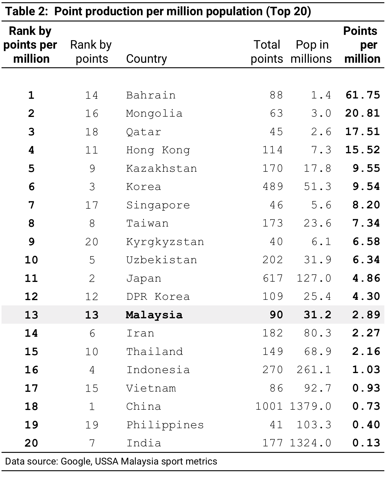
As usual with this kind of comparison relatively small population countries like Bahrain, Qatar, and maybe Mongolia, skew the results, and likewise for countries with especially large populations like China and India. When point production per million population is compared these countries tend to shift position on the points table.
Table 2 lists the countries according to points per million population. Statistically this is not really a reliable metric because there are so many variables that can affect the outcome, economic strength and overall development being just two of them. But we can see that Bahrain, Qatar, and Mongolia, all near the bottom of the points chart in Table 1, are now at the top in points per million population, and China and India, two top point getters, are at the bottom in terms of population.
Is Table 2 significant? Not in any real way. It's mostly interesting to look at if you're into numbers and unless we're able to plug in additional variables like economics and a development constant it doesn't really tell us much.
About this analysis
Although the sport systems in each country are all slightly different their efforts are directed toward similar goals, thus the closer countries get to producing high performance athletes the more their systems begin to look alike, so analysis like this appear to be comparing similar conditions.
However, sport development is subject to various social and cultural variables that are unique to each country. A deeper analysis of performance than the one presented in this article has to take these social variables into account. The present analysis does not do this and thus cannot offer reasons as to why certain countries performed as they did.
Another factor that affects overall performance is travel. Poorer countries might have sent only their very best athletes to the Games while others sent much larger teams. Larger teams usually have an advantage in multi-sport competitions. Travel cost plays a significant role in determining how many athletes will attend.
Finally, it is important to point out the questionable nature of determining winners in large multi-sport competitions. Our analysis of the 2017 SEA Games and the 2018 Commonwealth Games pointed out that any scoring system used, ours included, offers only a superficial look at what really took place. The real results occur within each sports tournament and probably should not be combined into an overall winner, medal counts notwithstanding.
Next up is our Malaysia Games analysis. The SUKMA, as it is known locally, gets underway on 11 September and features competition in 29 sports between all Malaysian states and the country of Brunei.


